You refer early on to the “The Big Five” – Mouse, Kelley, Griffin, Victor Moscoso, and Wes Wilson – but also manage to pay tribute to many great artists in the book. For you, what defined “The Big Five”; what made them stand out from the rest?
They were the ones who created the art form. Look at what they did: Wes Wilson was an innovator with lettering, using lettering as an image that was crucial to the art form. Moscoso studied color theory – and then broke all the rules he had learned. Griffin introduced mythology and mysticism. Mouse brought in a beautiful feel for Art Nouveau. Kelley was actually a central figure in all of this – maybe the central figure – with his affinity for pop cultural imagery … a different feel and a different look.
Another thing that’s very peculiar to the art form is that the artists created their designs without any association with the band itself.
That’s true – they were independent artists.
In the beginning the posters were advertising dances. They weren’t concerts; they were dances. The Dead were the guys living down the street – they weren’t anything special, you know? (laughter)
Apart from the lovely reproductions of the posters themselves are the parts of the process you share – the rough sketches, the blue-lines, and the color overlays.
Yes – the book is actually written more towards artists. When a fan comes in, they want to see the rarest poster of their favorite band. When a collector comes in, they want to see an archival poster. But when an artist comes in, they want to see what are called “process materials”; they want to see a blue-line; they want to see a scrappy piece of paper. They don’t care what it looks like – they’re interested in the process. I always find it so refreshing. So that’s why so much of the book includes process material – again, it’s about the art.
I hear you – but at the same time, I don’t think it will put off the average reader.
Oh, I absolutely agree with you. As I said before, Grateful Dead fans are like no other fans; they know the artists and they appreciate the art. They really are different from all other fans.
A lot of those process materials are truly examples of one man’s trash being another’s treasure. I imagine you’ve done your share of picking in the trash over the years …
Yes, I’ve literally dug things out of dumpsters … I really did. A lot of that material had no economic value at the time; it was meant to be thrown out. But to me, it was interesting stuff, so I dug through the trash to find it and save it. I didn’t care about the economic value; I cared that it explained the process of how the art was made.
When did you begin the process of actually putting the book together?
About 10 years ago. My wife died of cancer in 2007 – it was a very difficult time and I set the book aside for a while. At that point, I’d gone through three or four reiterations of the book in terms of how it would look and how it would feel.
After my wife passed away, a period of time passed before I returned to the book – and that’s when I came up with the look that you see. The book really grew organically.
As it was meant to.
Yeah, yeah.
Any surprises to you amongst the art that’s on the pages – anything that was new to you while putting the book together?
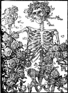
One would be seeing Edmund Sullivan’s original illustration that Mouse and Kelley used for “Skeleton & Roses”. When you look at the original art, you can see that Sullivan covered over parts; you can see the pen marks on the side where he was cleaning off his pen tip. The original was “Quatrain No. XXVI” – the number 26 … and it was just happenstance that it was used for “Family Dog #26”.
Another thing was seeing the difference between the first printing and the second printing of say, “Family Dog #17” [poster for Jefferson Airplane/Great Society]. The first printings were the way they were because Kelley and Mouse were there. When they did the artwork for the posters, they took into consideration how the press would print it. They both saw the posters as a piece of art where the printing was part of the art. It was an object – not just an image.
I probably shouldn’t tell you this, but of all the wild and wonderful work that Mouse and Kelley created together, our favorite – my wife and I – is the “Peace” poster with Winnie The Pooh, which we have on our wall at home. It’s a relatively simple two-color design, but it’s beautiful in its simplicity. We were tickled to see it included in the book.
I’ll have to look at that again. It’s a pop cultural image – and probably Kelley is the one who came up with it. In the beginning – the early months of 1966 – they did not have an image bank they were drawing from. That would have come from Kelley.
How about a desert island pile of some of your favorites from over the years?
Oh, let’s see … “Family Dog #17” that I just mentioned – the first printing, in silver … “Family Dog #78” – the Steve Miller Band … and there’s the one that Mouse did for Siouxsie and the Banshees, which is one of the first posters I published. I’ll tell you a little bit about that one.
I found the original photo and gave it to Stanley to work with. He got the splatter-effect background by holding a wet paintbrush up to a airbrush. He did the lettering for “Siouxsie and the Banshees” by using a magic marker on paper toweling and an overhead to project it and trace it. That poster was printed with two hits each of fluorescent ink – it fades quickly, so we did two hits each – to create the day-glo poster. It’s in the book.
I’m looking at it now on page 34; it’s beautiful. And that’s a great story.
Isn’t it? And you can see how different it is from his earlier work.
Well, Philip, I want to thank you for putting this book together. I really can’t come up with a better phrase than “labor of love” to describe it. Good luck and take care.
Thank you so much.
*****
Brian Robbins hangs all his stuff on the walls of www.brian-robbins.com.
No Comments comments associated with this post